How I convert a design idea into a clean UI
test
Summarize this Blog with AI
On this page
When a great design idea comes to mind, most people make the mistake of jumping straight into Figma or code. But creating a clean and professional UI requires a system. Based on my experience, I have built this 10-step process to help turn ideas into polished, high-quality interfaces.
1. Clearly Define the Idea
Before designing anything, the foundation must be strong. Design is not just about making things look good — it is about solving a problem effectively.
Be clear about these 4 questions:
- 1. What problem does the design solve? (What is the purpose?)
- 2. Who is the target user? (Who will use it?)
- 3. What are the core features? (Core functionality)
- 4. What is the use case? (How will they use it?)
Example
IoT Dashboard → Device tracking + Notifications + User management
2. Create a Rough Layout (Wireframe)
Do not think about colors or fonts yet. First, focus only on the structure. Sketch simple blocks on paper or in Figma.
What should your focus be?
- Layout clarity
- Information hierarchy
- User flow
"Where will the header go? What should be in the sidebar? How large should the content area be? — all of this is decided at the wireframing stage."
HeaderSidebarMain ContentFooter3. Build a Design System
A design system is essential for creating a clean UI. Instead of using random colors and styles throughout the project, define the rules in advance.
1. Colors (Example)
Primary
Base Text
Background
2. Typography
Heading Font
Body Font
Small Text
3. Style Variables
- Spacing: 8px scale
- Radius: xl (12px)
- Shadows: Flat / Soft
4. Keep the UI Simple (Minimalism Rule)
Golden rule: Clean UI = Fewer Elements. When in doubt, remove things instead of adding more.
❌ Avoid This
- • Using too many colors
- • Using 3–4 different font styles
- • Placing too many buttons on a single screen
- • Applying dark shadows to everything
- • Using random spacing (5px here, 12px there)
✅ Follow This
- ✔ Use generous white space
- ✔ Keep sections visually clear
- ✔ Maintain consistent spacing
- ✔ Pay attention to proper alignment
5. Maintain Consistency
A single visual style should be maintained across the entire project. If one card has rounded corners, another should not suddenly have sharp edges.
❌ Bad Example (Inconsistent Styles)
Button 1 Button 2 Button 3All three buttons look different, which makes the design feel inconsistent and unpolished.
✅ Good Example (One Visual Style)
Save Data Cancel Edit FormHere, the size, padding, and corner radius of every button are consistent.
6. Use Proper Typography
Never set font sizes randomly. Follow a standard type scale instead. Tailwind already provides a good default typography system.
Best Clean UI Rule
Heading 1 32px (text-3xl)Heading 2 24px (text-xl)Heading 3 20px (text-lg)Body Text 16px (text-base)Small Details / Date 14px (text-sm)❌ Avoid (Random Sizes)
13px, 17px, 21px
✅ Use (Tailwind Classes)
text-sm, text-base, text-lg, text-xl
7. Follow a Spacing System
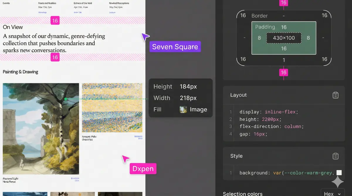
One of the biggest secrets behind a clean UI is spacing. Do not crowd everything together. Let your design breathe. Always use spacing in multiples of 8px.
8px Grid System (Tailwind)
16pxp-4 / gap-4 / m-424pxp-6 / gap-6 / m-632pxp-8 / gap-8 / space-y-8❌ Avoid: p-[13px], m-[7px], gap-[11px]
8. Create Visual Hierarchy
When a user looks at a screen, they should immediately understand what matters most. If every piece of text looks the same, the user will get confused.
Order of attention:
- Most important (Largest and boldest — e.g. title)
- Secondary (Slightly smaller — e.g. description, subtitle)
- Details (Smallest, lighter color — e.g. date, small labels)
12 Nov, 2024
Mastering UI Design: The Ultimate Guide
Learn how to transform messy ideas into beautiful, user-friendly interfaces using proven systems and frameworks.
Read Article
9. Build Reusable Components
Clean UI also means avoiding repeated code. Build a perfect button or card once, then reuse it throughout the entire project.
📁 Next.js / React Project Structure Example:
- 📄 /components/ui/Button.tsx
- 📄 /components/ui/Card.tsx
- 📄 /components/ui/Input.tsx
- 📄 /components/ui/Modal.tsx
This approach makes development easier. If you ever need to change the button color in the future, updating just one file (Button.tsx) will update it across the whole website.
10. Final Formula for a Clean UI
There is only one real path to success: follow the process. Always work in this sequence.
Idea→
Wireframe→
Design System→
Components→
Final UI⭐ Pro Tips (For the Best Results)
- 📐 Always use a grid for better alignment.
- 📏 Follow the 8px spacing system (4, 8, 16, 24, 32).
- 💨 Use Tailwind’s default classes as much as possible and avoid too many custom classes.
- 🎨 Follow the 3-color rule: Primary (60%), Secondary (30%), Accent (10%).
- 🔤 Use only one font family. Avoid mixing too many fonts.
FAQs
Frequently asked questions
testte
test
test
test
Written by

Dipen Nagani
Senior UI/UX Designer
As a User Experience Designer at Seven Square®, I contribute to enhancing digital experiences by leveraging my skills in UI/UX, CSS, and GSAP. My focus is on creating intuitive and visually engaging user interfaces that align with user needs and business goals.