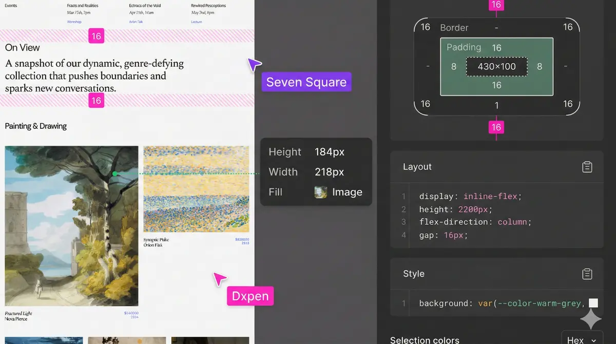
Designing with Context: How to Create and Use Accessibility Annotations for Better Handoff
Bridge the gap between design and development by implementing accessibility annotations. Learn how to document keyboard navigation, focus orders, screen reader behaviors, and heading structures directly in your design files.

Summarize this Blog with AI
On this page
When a design transitions from a canvas to production code, critical contextual details are often lost in translation. Among the most vulnerable of these details are accessibility (a11y) requirements. While visual hierarchy, color palettes, and spacing systems are easily inspectable in modern design tools, interactive behaviors like focus order, screen reader announcements, and keyboard navigation paths are invisible on a flat artboard.
To prevent accessibility from becoming an afterthought or a source of post-launch technical debt, product teams are turning to accessibility annotations. By documenting accessibility requirements directly alongside the visual design, teams establish a shared language that streamlines the developer handoff and ensures a more inclusive user experience.
Why Accessibility Fails in the Design-to-Dev Transition
Most accessibility issues on the web do not stem from a lack of care; rather, they arise from a lack of explicit communication. Designers often assume that developers will naturally understand the semantic structure of a layout or how a custom dropdown should handle keyboard focus. Conversely, developers—under pressure to meet tight deadlines—may implement components using default, non-semantic HTML structures because the design file did not specify otherwise.
Without explicit guidance, critical details are missed. Common oversights include:
- Missing alternative text for complex icons or illustrative graphics.
- Arbitrary tab order that does not match the logical reading flow.
- Modals and dropdowns that trap focus or fail to return focus to the trigger element when closed.
- Improper heading structures that break screen reader navigation.
By bringing these considerations into the design phase, you treat accessibility as a fundamental design requirement rather than a post-development checklist item.
Key Areas to Document with Annotations
Effective accessibility annotations do not need to cover every WCAG success criterion, but they should target the elements where developer assumptions are most likely to diverge from design intent. Focus your documentation efforts on these four key areas.
1. Heading Structures and Document Outline
Visual size does not always correlate to semantic importance. A designer might use a small font size for a visual eyebrow tag but intend for it to act as an H2, or use a large display font for a callout that should functionally remain an H3. Annotating heading levels (H1 through H6) ensures that screen reader users can navigate the document outline logically.
2. Interactive States and Focus Order
For keyboard and screen reader users, the tab key is the primary tool for navigating an interface. Designers should explicitly map out the focus order—the sequential path a user takes when pressing the Tab key. This is especially crucial in multi-column layouts, grids, and interactive dashboards where the default browser focus path might feel unintuitive or broken.
3. Screen Reader Text and ARIA Attributes
Sometimes, visual elements rely on context that isn't immediately obvious to non-visual users. For instance, an icon-only button (like a pencil icon for "Edit") needs an explicit accessible name. Use annotations to specify the exact aria-label or visually hidden screen reader text that developers should implement. Additionally, document state attributes such as aria-expanded="true/false" for toggles or accordions.
4. Keyboard Traps and Focus Management
When an interactive overlay like a modal, dialog, or drawer opens, keyboard focus must be directed inside that element and trapped there until it is closed. Once closed, focus must return to the original trigger button. Annotating these boundaries prevents users from accidentally navigating background elements while an overlay is active.
Implementing an Annotation Kit in Your Design System
To make annotations scalable and consistent, integrate an accessibility annotation kit directly into your team's design system. This kit should consist of a small library of reusable visual markers that are easily distinguishable from the actual product UI.
Your annotation kit should include:
- Numbered Badges: Used to indicate focus order sequences (e.g., 1, 2, 3, etc.).
- Heading Tags: Small, pill-shaped labels indicating semantic headings (e.g., [H2], [H3]).
- Interaction Callouts: Text boxes containing explicit notes regarding keyboard behavior, such as using the arrow keys to navigate within a custom radio group.
- Color Contrast Badges: Labels verifying that a specific text-and-background pairing meets contrast standards, especially for high-risk UI elements.
By standardizing these visual components, developers will learn to recognize accessibility callouts instantly, transforming the handoff document into an interactive blueprint rather than just a visual guide.
Streamlining the Handoff Workflow
Adding annotations should not feel like an administrative burden. To successfully adopt this workflow, introduce accessibility planning early in your design lifecycle, during wireframing or initial prototyping. When it comes time for the official handoff meeting, review the annotated paths alongside the visual designs.
This collaborative review session serves two purposes: it ensures developers understand how to implement the required accessibility behaviors, and it allows them to provide immediate technical feedback if a proposed interaction pattern is overly complex or difficult to achieve in code. The result is a cleaner implementation, a shorter QA cycle, and an application that is usable by everyone.
FAQs
Frequently asked questions
What are accessibility annotations?
Accessibility annotations are visual markers, labels, and notes added to design files (like Figma or Sketch) that instruct developers on how to implement accessible features, such as heading hierarchies, focus states, and screen reader labels.
Who is responsible for creating these annotations?
Designers typically author accessibility annotations during the design phase, but they are often created in collaboration with product managers, developers, and accessibility specialists to ensure technical feasibility.
Do I need to annotate every single screen in my design file?
No. Focus your annotations on unique components, complex interactive elements (like modals, dropdowns, and forms), and templates. You do not need to repeat annotations for identical instances across every screen.
How do annotations help the development team?
They remove guesswork by clearly defining expected programmatic behaviors, semantic HTML tags, and ARIA attributes, reducing the need for back-and-forth communication and decreasing the number of bugs found during QA.
Should we use a specialized tool or plugin for annotations?
While there are several excellent Figma plugins available for accessibility annotations, you can also build a simple, custom component kit within your own design system using badges and callout cards.
How do accessibility annotations affect the product timeline?
While annotating adds a small amount of time to the design phase, it significantly reduces development and QA cycles by preventing accessibility bugs from being built in the first place, saving time overall.
Written by

Dipen Nagani
Senior UI/UX Designer
As a User Experience Designer at Seven Square®, I contribute to enhancing digital experiences by leveraging my skills in UI/UX, CSS, and GSAP. My focus is on creating intuitive and visually engaging user interfaces that align with user needs and business goals.