Shivatva
- Role
- Product Designer
- Platform
- Responsive website
- Audience
- Brand visitors, customers, and content explorers
- Year
- 2025
- Tools & skills
- Figma · Next.js · Tailwind CSS · Framer Motion · GSAP

Context
Project overview
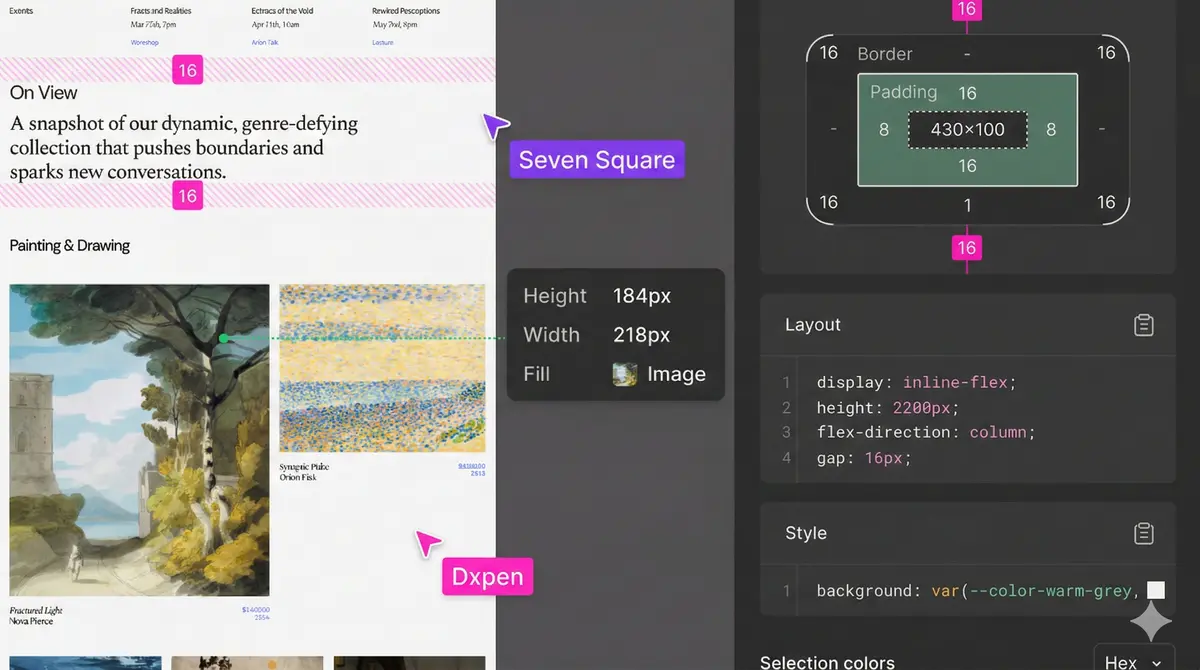
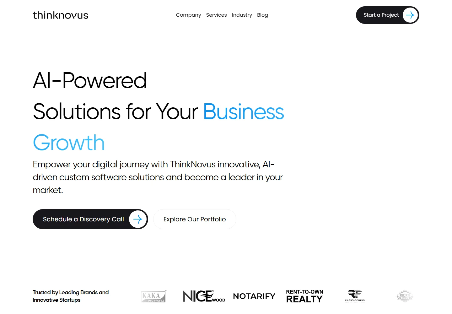
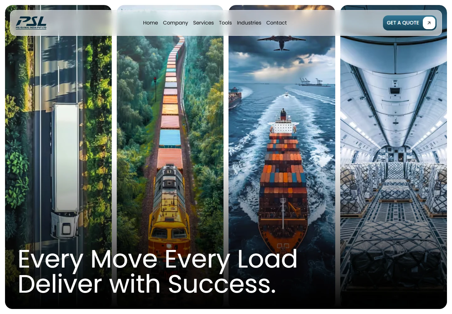
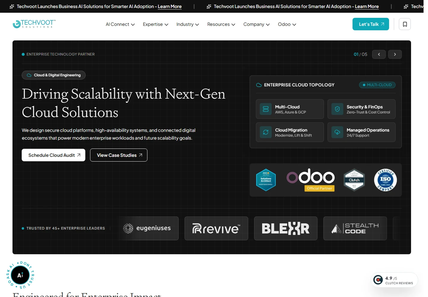
An intuitive responsive web interface designed in Figma and developed with Next.js and motion effects for a smooth brand experience.
Planning work in this area? Explore Frontend UI development that protects design intent for the scope, deliverables, and collaboration process.
Problem
Business and user problem
The experience needed to balance visual appeal, intuitive navigation, and responsive frontend execution.
Contribution
Role & responsibilities
- Responsive interface design
- Scalable design system
- Frontend development
- Motion design
Users
Audience
Brand visitors, customers, and content explorers
How the work was structured
Design approach
- Designed a clean, intuitive UI direction in Figma.
- Used motion effects to make transitions feel fluid while keeping the page usable.
Decision · reason · result
Key UX decisions
Pair brand storytelling with predictable navigation
The visual experience needed space to feel distinctive while remaining easy to explore.
Content blocks and navigation keep their hierarchy across screen sizes.
Apply motion through shared rules
Consistent transitions create a smoother experience than isolated effects.
The implemented experience feels cohesive across sections and devices.
Designed experience
Final UI screens
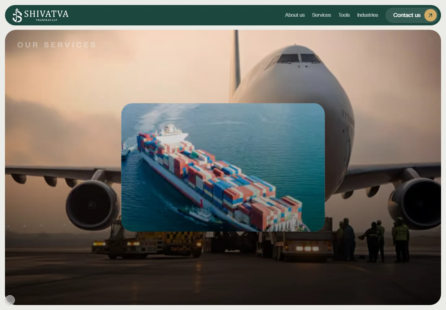

Interface areas and reusable patterns
UI system
Scalable patterns
Design system & components
Reusable layout sections, visual rhythm, and motion rules help the brand experience stay cohesive across screens.
Design-to-code continuity
Development and handoff
- Translated the design into responsive Next.js components.
Documented result
Project outcome
A polished responsive website experience.
Consistent UI and motion patterns.
Frontend implementation aligned with the Figma design.
Questions
Project details
What was the focus of Shivatva?
Shivatva focused on intuitive responsive UI design and frontend execution with Next.js and motion effects.
Related thinking