Skip to content
Interface clarity

UI/UX design for clear, usable product interfaces

I design web and mobile interfaces that make the next action clear, keep complex content readable, and behave consistently across screen sizes.

How I approach it

Designed around the product context

Strong UI/UX work is not a visual layer added at the end. It is the structure that helps people understand where they are, what matters, and what will happen next. I combine flow design, interface hierarchy, responsive thinking, and reusable patterns to make the experience coherent from screen to screen.

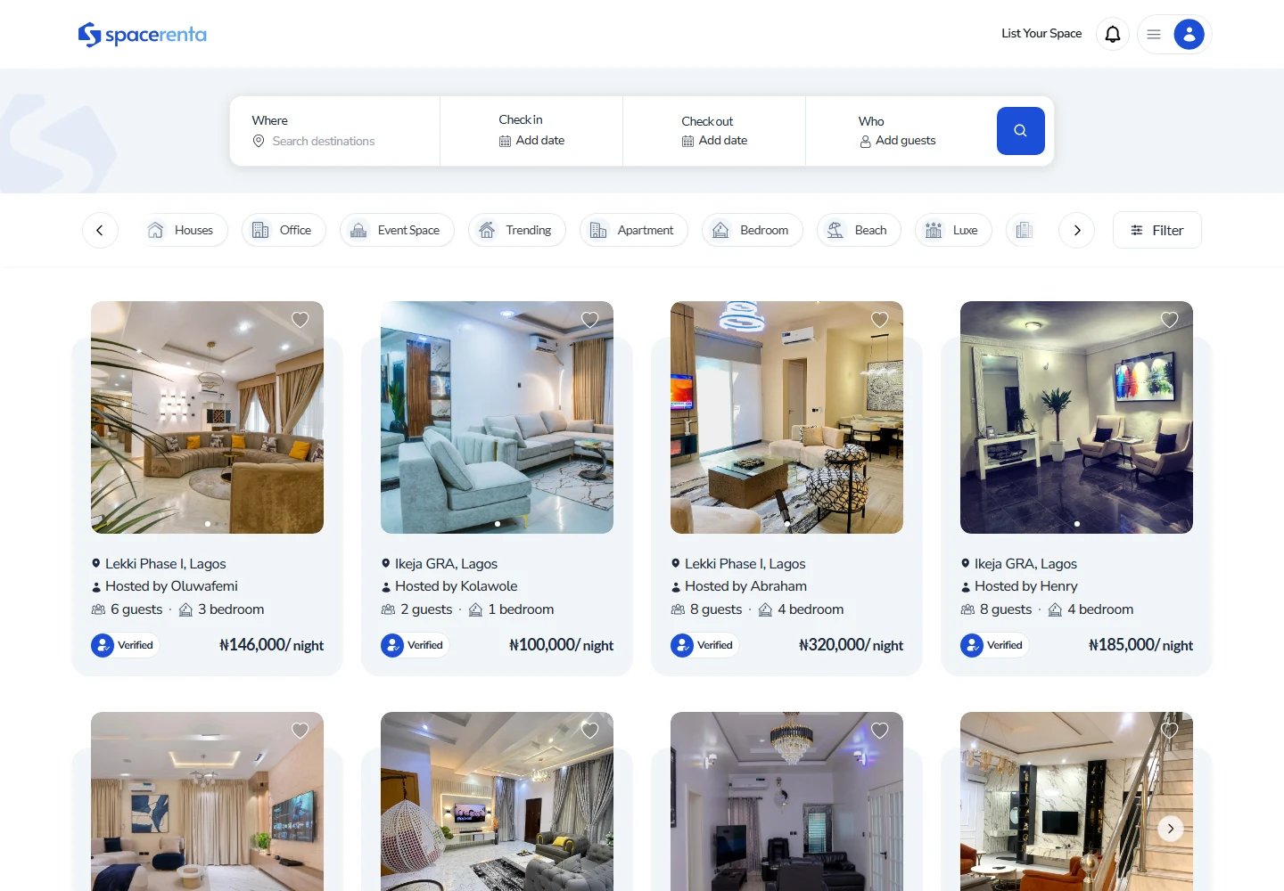
Explore a related product in Spacerenta: Space Rental Marketplace, then use the examples below to compare the work with your brief.

Problems I solve

Where this work creates useful clarity

Users cannot find the next action
The interface contains the right features, but hierarchy and navigation do not make the intended task obvious enough.
Screens feel visually inconsistent
Repeated actions, forms, cards, and status patterns behave differently, increasing both cognitive load and implementation effort.
Responsive behavior is an afterthought
Desktop layouts are compressed for smaller screens without reconsidering task priority, content order, or touch interaction.
Polished screens still have interaction gaps
The main view looks complete, but validation, feedback, disabled states, and transitions have not been resolved.

What I deliver

Practical outputs for design and delivery

UX review and flow recommendations
A focused assessment of navigation, hierarchy, interaction friction, and the screens that need the most attention.
User flows and wireframes
Task-level flows and layout exploration that establish structure before high-fidelity interface work begins.
High-fidelity Figma design
Clear, production-minded screens with consistent hierarchy, spacing, actions, forms, and feedback patterns.
Responsive and mobile states
Layouts designed around each working context instead of treating mobile as a smaller desktop canvas.
Interaction and handoff detail
Documented states, prototypes where useful, component behavior, and practical notes for implementation.

Process

A structured path from context to UI

  1. Step 01
    Understand the task and context
    I review who is using the interface, what they are trying to complete, and where the current journey creates uncertainty or unnecessary effort.
  2. Step 02
    Establish flow and hierarchy
    I define navigation, content priority, actions, and screen relationships before deciding how the interface should look.
  3. Step 03
    Build the visual interface
    I turn the approved structure into responsive, high-fidelity UI using repeatable components and explicit interaction states.
  4. Step 04
    Review the complete experience
    I check consistency across the journey, refine edge cases, and prepare the design so implementation decisions are not left implicit.

Expertise

Capabilities applied to this work

The exact mix depends on the product, its maturity, and the team already involved.

  • User flows and information architecture
  • Interaction design
  • Visual hierarchy
  • Responsive web interfaces
  • Mobile product UI
  • Accessible interface patterns

Prepare your project brief

Use these checklists to clarify the decisions and inputs for this service.

Guide

A practical brief for turning user tasks, roles, and exceptions into a designable product flow.

FAQ

Questions about this service

Have a product idea or design challenge?

Let's create a clear, scalable, and thoughtful digital experience.

Discuss a Project