How to Design Component APIs for Better Developer Handoff
Bridging the gap between design and engineering requires more than just sharing a Figma link. Learn how to design component APIs that align design tool variants with frontend code properties for a seamless handoff.

Summarize this Blog with AI
On this page
The Core Challenge of the Design-to-Development Handoff
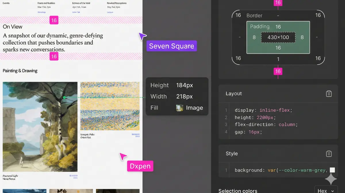
For years, the handoff process between design and engineering has been a source of friction. Designers hand over high-fidelity screens, and developers are left to interpret the underlying layout logic, states, and variable spacing. While modern design tools have closed the gap with features like auto-layout and reusable components, a fundamental disconnect remains: the way designers structure visual options often differs from how developers write code. To solve this, product teams must shift their focus from handing off static visuals to designing cohesive component APIs.
A component API defines the inputs (props) that a component accepts and the outputs it produces. When designers and developers co-create these definitions, the translation from design system to production code becomes seamless. This alignment reduces communication overhead, minimizes visual bugs, and ensures that the end-user experience matches the design intent perfectly.
Aligning Design Variants with Code Properties
In modern UI libraries like React, Vue, or Svelte, components are controlled by properties, commonly known as props. In design tools like Figma, components are managed using component variants and properties. Aligning these two systems is the first step toward a robust component API.
To create a shared language, designers should structure their component variants to mirror code-friendly logic. There are three primary types of properties you should define collaboratively:
- Boolean Properties: These are binary switches, representing an on/off or true/false state. Examples include
isDisabled,isLoading,hasIcon, orisFullWidth. Structuring these as booleans in your design tool makes it incredibly easy for developers to map them directly to code logic. - Enum and String Properties: These are used when a component has multiple mutually exclusive options. For instance, a button might have a
variantprop with options like "primary", "secondary", or "tertiary", or asizeprop accepting "small", "medium", or "large". Designers should avoid creating separate components for these variations and instead use unified variants named precisely after these options. - Slot and Node Properties: These define placeholder areas where other content or components can be injected. For example, a card component might have a
headerslot and afooterslot. In design, this is represented by layout zones where nested instances can be swapped.
Establishing Structurally Sound Constraints
Good component APIs do not just define what is possible; they also set boundaries for what is not allowed. When designing a component, consider how it behaves under extreme conditions. What happens when the text inside a button wraps to two lines? How does a card scale when its container expands on a wide monitor?
By defining explicit constraints, you prevent layout shifts and display bugs. Designers can specify these rules within the design system documentation. For instance, you might establish that a button component has a maximum width or that an icon always maintains a 1:1 aspect ratio. Developers can then encode these constraints directly into the component's CSS, ensuring that no matter what content is passed to the API, the visual integrity remains intact.
Documenting Interactive States and Transitions
A static design mockup only captures a fraction of the user experience. A complete component API must also document how a component behaves during user interactions. This includes hover, focus, active, disabled, and loading states.
Rather than drawing separate screens for every interaction, designers should document a state matrix for each component. This matrix outlines the visual changes for each state alongside the functional triggers. Crucially, don't forget keyboard navigation and accessibility. Documenting which element receives focus and how the focus ring is styled is a vital part of the component API that developers need to implement accessible web interfaces.
Working Together on a Component Schema
The best way to implement this methodology is to run a collaborative "schema session" before writing code or finalized designs. During this session, a designer and a developer look at the proposed UI element and write down its schema in plain text or a simple markdown file. Discussing questions like "Should the icon placement be a string prop or a separate boolean?" before implementation saves hours of refactoring later. The resulting schema acts as a contract that both parties agree to respect, leading to cleaner codebases and more predictable design updates.</
FAQs
Frequently asked questions
What is a component API in product design?
A component API is the defined set of inputs, properties, and outputs that govern how a user interface element behaves, looks, and configures. It ensures designers and developers use the same logic to manipulate UI elements.
How do Figma variants map to frontend code properties?
Figma variants map directly to component props in code. Boolean variants in Figma map to boolean props, while multi-option variants map to string enums or union types.
Why is naming consistency important in component APIs?
Consistent naming between design tools and codebases reduces cognitive load, prevents communication errors, and makes it much faster for developers to locate and implement the correct design variables.
Should designers write code to understand component APIs?
While designers do not need to write production code, understanding basic component architecture and programming logic helps them design more realistic, robust systems.
What are slot properties in UI components?
Slots are designated zones within a component that allow external content or other components to be passed in, offering flexibility without breaking the parent component's structural layout.
How can we document component states effectively?
Create a state matrix that showcases the component under different states like default, hover, focus, active, disabled, and loading, documenting both the visual changes and interactive triggers.
Written by

Dipen Nagani
Senior UI/UX Designer
As a User Experience Designer at Seven Square®, I contribute to enhancing digital experiences by leveraging my skills in UI/UX, CSS, and GSAP. My focus is on creating intuitive and visually engaging user interfaces that align with user needs and business goals.